Open banking savings app
A digital savings proposition
Too many people in the UK have money sitting in the wrong place. They could be saving more and making their money work harder for them.
Through open banking, this savings mobile app connects to your bank account and does the hard work for you, in line with your priorities. It’ll spot when things have changed a little and adapt your savings plan around that, ensuring a stronger financial future.
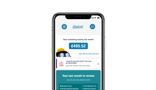
It would calculate how much money you’d have left at the end of each month. Then it would prompt you to set personal priorities and invest some of your remaining money in a stock & shares ISA.
My role
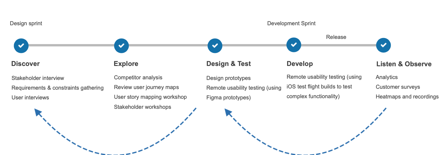
I was part of the Global UX team in Standard Life and was aligned as a Lead UX designer for 6 months on this project.
Initially, the product team worked with an external agency to research and design the core proposition. Then they handed over any existing research and strategy to me and my role was to own it and evolve it.
I conducted UX research in the first few months to evaluate the developed beta version. I tracked customer surveys, and analytics, and reviewed usability-related bugs. Once the app was released in the app store I designed and evaluated new features based on the product roadmap.
Moreover, I improved the ways of working in the product team and introduced UX methods to test & validate design ideas.
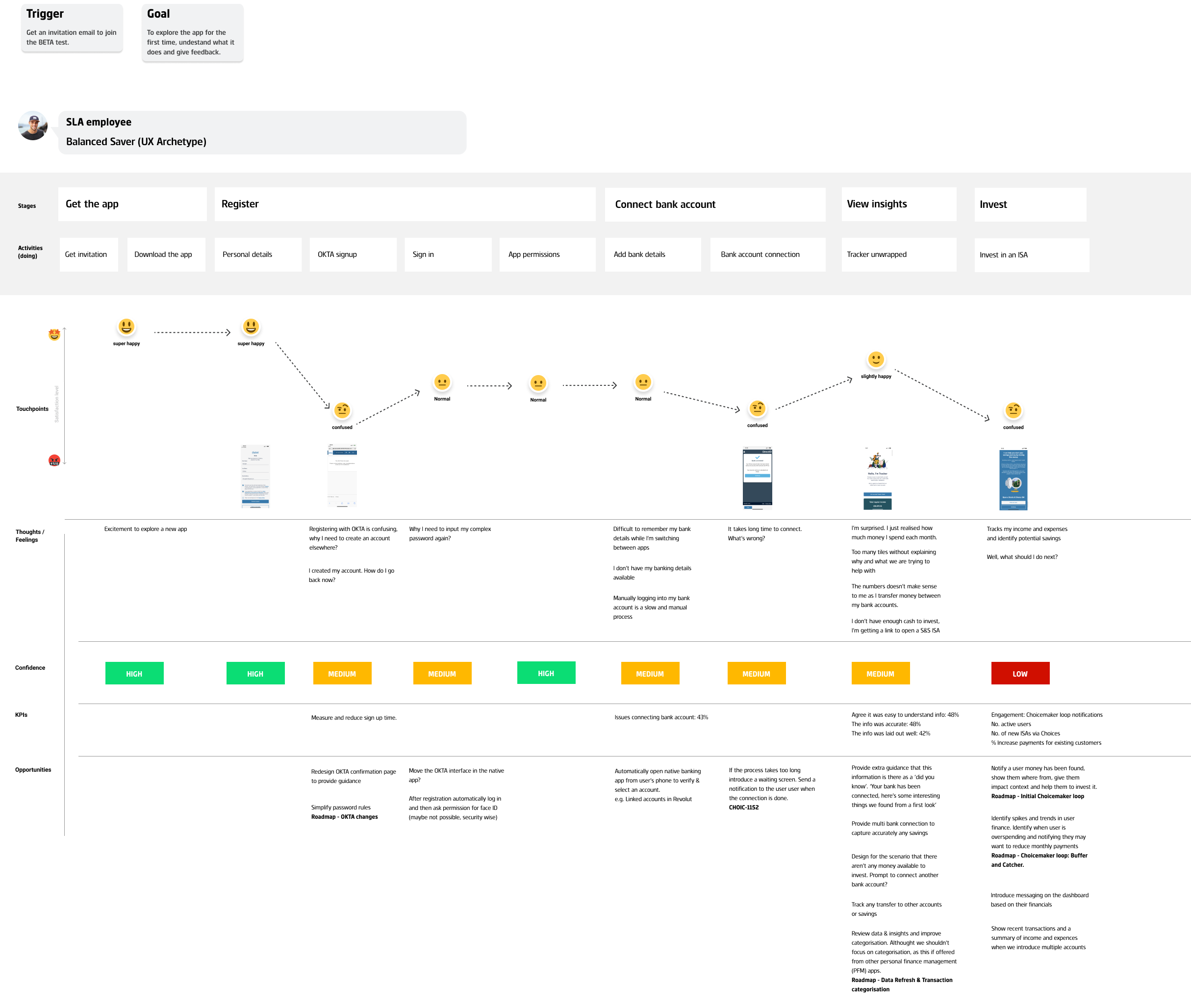
Evaluate the onboarding journey
The product team set up a user panel and launched the MVP version of the app to 100 people. I evaluated the onboarding journey of the app by reviewing an end-of-journey survey.
Main user pain points discovered:
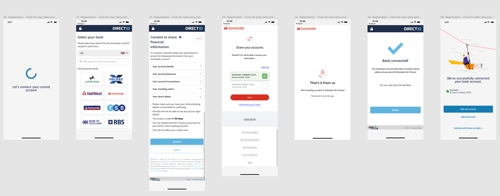
- Users were confused when pushed out of the app to sign up on a third-party website.
- There was a clear desire from users for multiple account functionality
- Users were querying income and expenses insight accuracy.
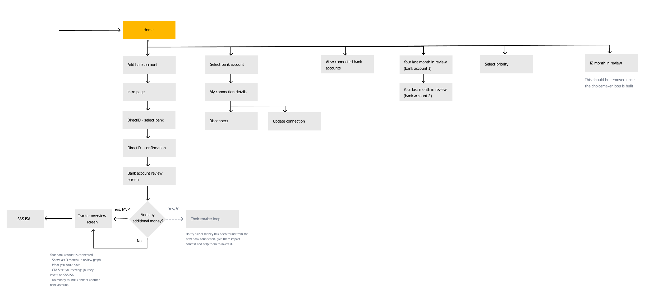
I mapped the onboarding journey to map the above problems at each stage of the journey. Using the user journey mapping method it was easier to get an overview and also share the details with stakeholders.
I run a workshop with the team, to discuss opportunities to improve certain areas of the onboarding journey.
Identify the problem
From the initial research, I identified two main problems.
1. There was a clear desire from users for multiple account functionality
In the MVP version, after the signup process, users were able to connect to one bank account. At the end of the journey, the available balance wasn’t accurate, because of the way they manage their money.
Customer situations:
- Users with regular income – move savings every month to a different bank account
- Irregular income (shift work, self-employed)
- Share joint accounts
This resulted in inaccurate income and expenses reports.
2. Users were querying income and expenses insight accuracy.
Even when users had only one main bank account the income and expenses report sometimes wasn’t accurate. A few transactions were uncategorised and this affected the overall account balance.
Design hypothesis
- If people would be able to connect multiple bank accounts they would know exactly how much money they have available to invest every month.
- If people would be able to categorise their uncategorised transactions they would get a more accurate view of income and expenses. Therefore they would understand how they manage their money every month.
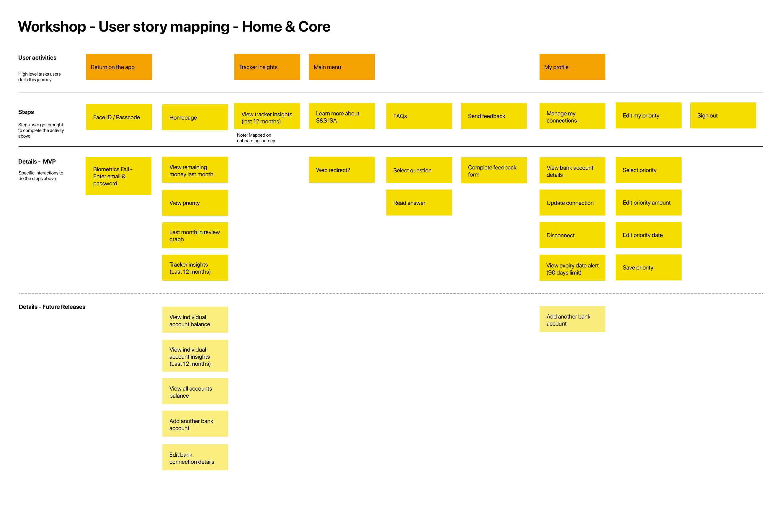
Map the current journey
I conducted workshops with Product Owners to map the current journey to get an end-to-end view of the app. This view was also useful to map future releases and understand how they would affect the existing journeys.
Ideation and design
Design a flow to add multiple bank accounts
I added a screen at the end of the account connection journey. In that way, people could easily add a second bank account.
Introduce categorisation in the income and expenses report
To analyse the issue of inaccurate insights, I worked closely with the development team and the product owner to understand the technical side and how developers used open banking to get the account transactions of each user.
Most of the transactions were categorised automatically. For example, the salary was tagged as an income and mortgages and loans as expenses. Although, it was highly likely for some transactions to be uncategorised. The solution to that issue was to let users manually identify those transactions and add them to a predefined category.
To design a solution for the transaction categorisation I had to understand how people would group similar transactions. I conducted a card sorting study to get answers to that problem. The results from this study helped us identify the main categories e.g. salary, groceries, bills, holidays etc.
During the ideation phase, I worked closely with a UI designer to design a system with a set of components to design prototypes faster. This also reduced the time of the usability testing rounds.
At first, the design idea was to show the average income & expenses, so we don’t end up with a list of detailed transactions. From the first usability testing round, I realised that this was confusing as people wouldn’t know in every case their monthly average income or expense.
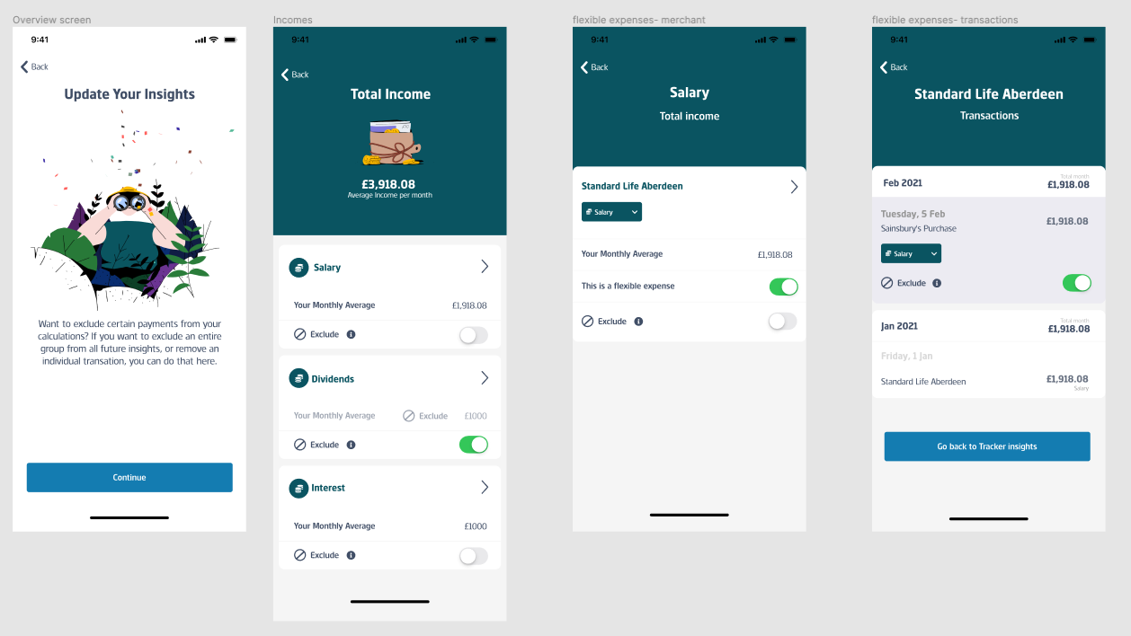
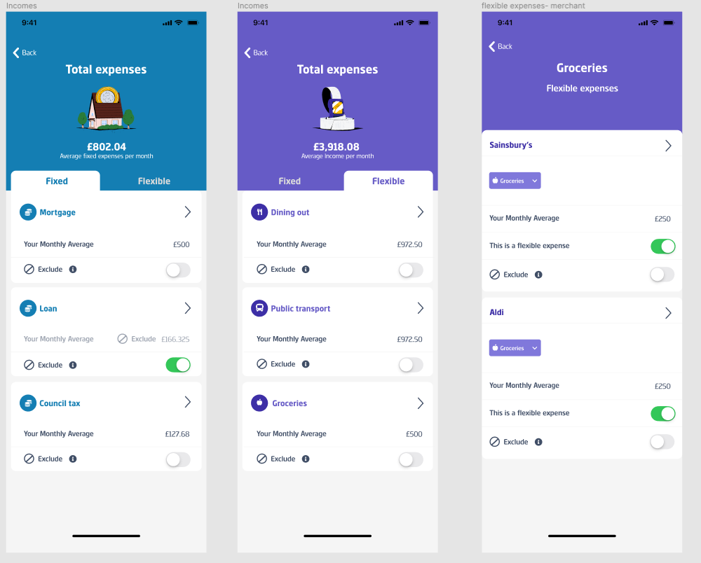
Based on the feedback from the usability testing round I refined the way the transactions were presented. I displayed the transactions in chronological order, in the same way, that people would see them on their banking statements.
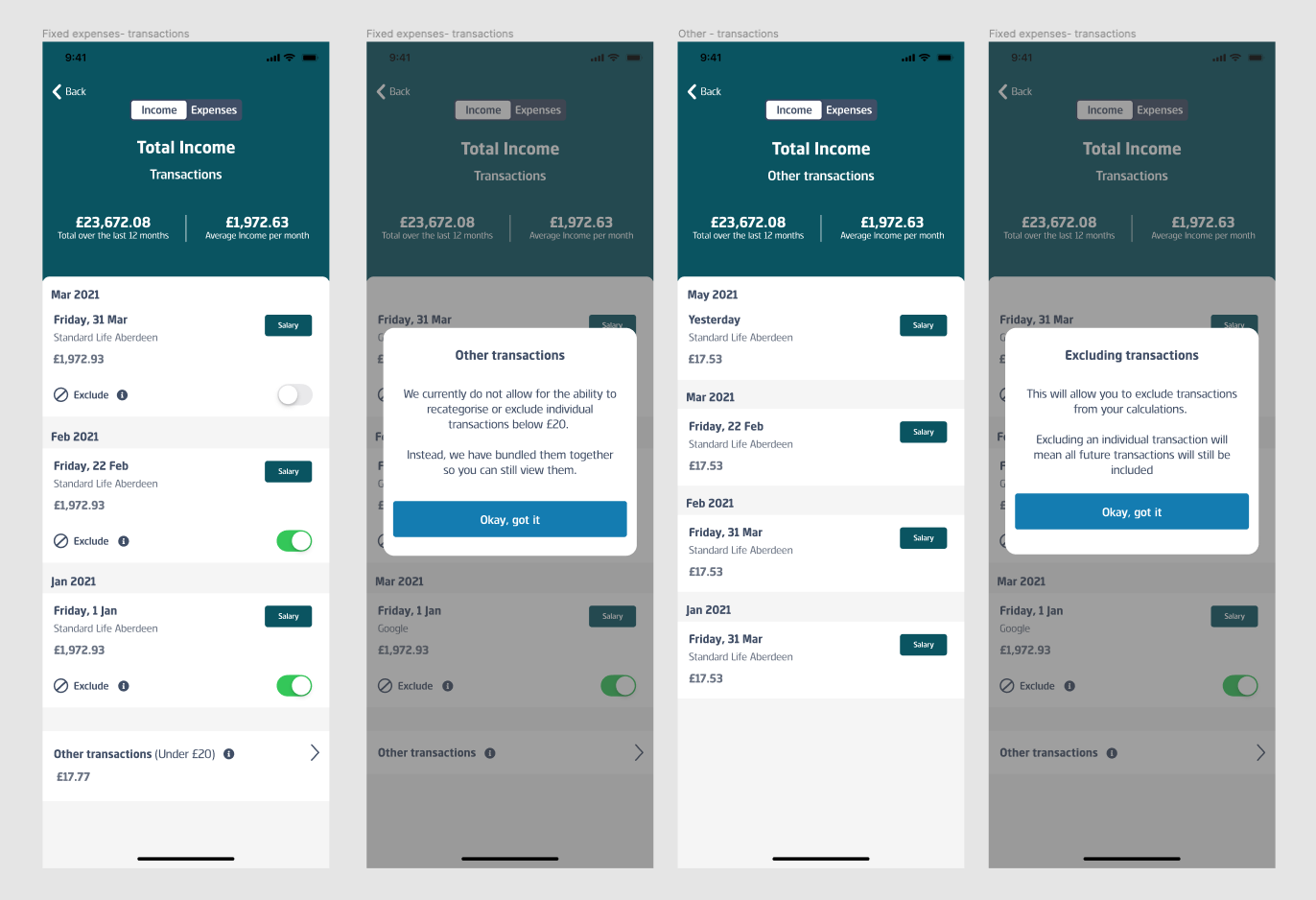

In the second round of usability testing, this concept performed much better. People could easily scan the list and understand the order of transactions.
Given that this was a design prototype, the plan was to work with the developers to implement a functional prototype and test it.
Conclusion
This project was a great opportunity for me to understand the power and limitations of open banking. I worked on this project just before the launch of the MVP version. This allowed me to understand how decisions from different stakeholders were made in the past and any project limitations.
During the testing and evaluation phase, it was important to share research insights with the product team to influence the proposition team and also bring developers closer to user insight.