Standard Life
Project details
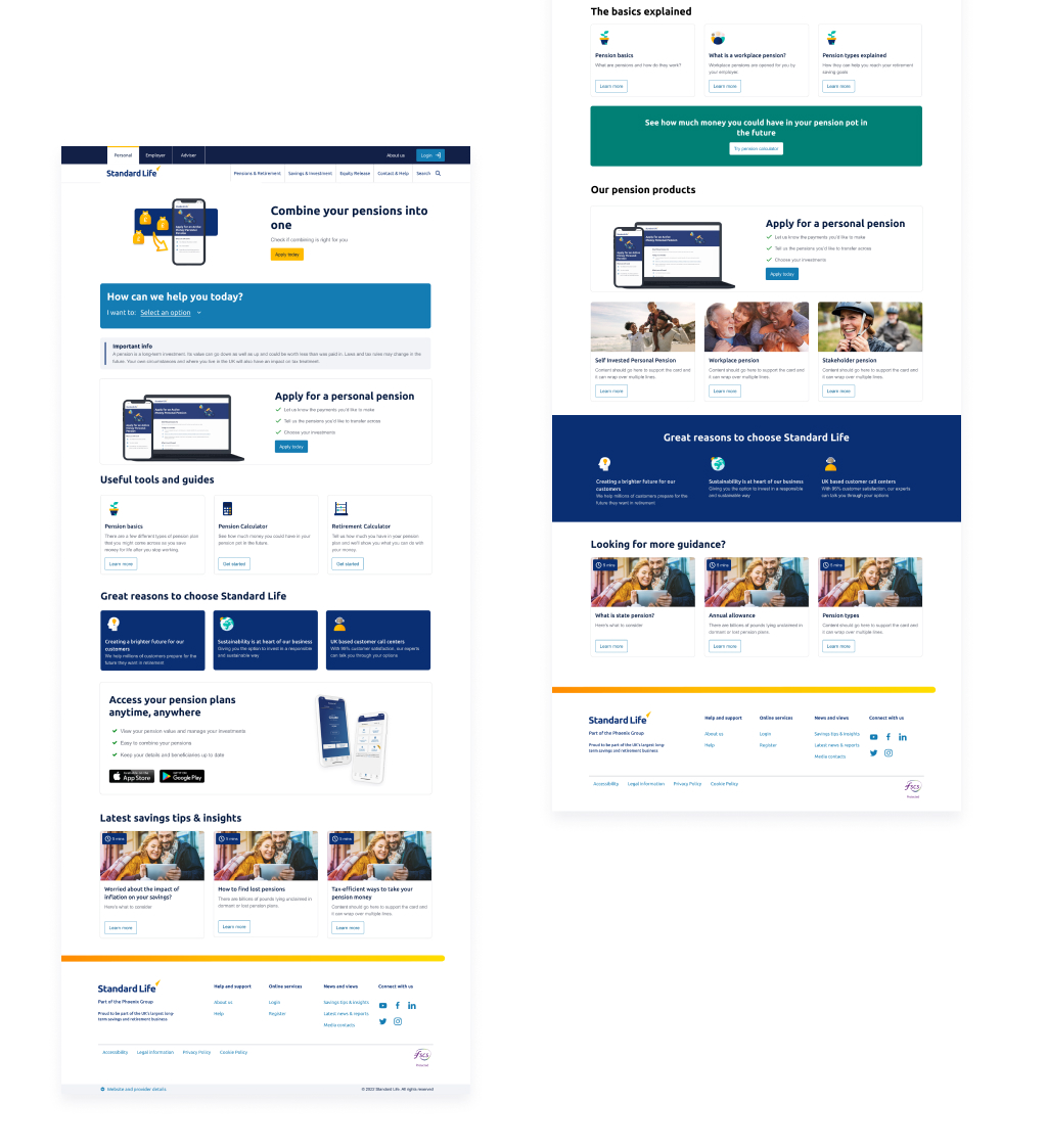
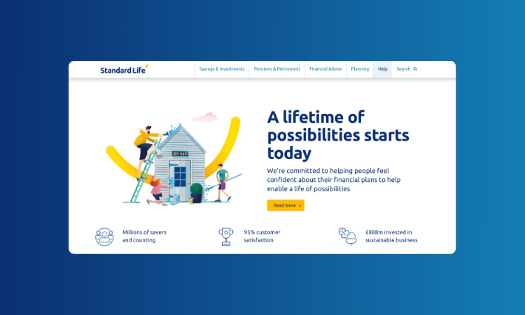
I worked with cross-functional teams and stakeholders at Standard Life to enhance the digital experience on standardlife.co.uk, with a focus on promoting new products, improve the website navigation and conversions. Designed digital journeys for people at different stages of the savings life cycle.
My responsibilities
- Increased conversion rates:
- Improved form usability which lead to an increase of new online pension applications by 39%.
- A/B testing:
- Planned and executed A/B tests using Google Optimize to improve marketing campaigns.
- Usability testing:
- Used usertesting.com to conduct usability testing on new concepts and evaluate the Information Architecture of the website.
- Design System and documentation:
- Played a key role in supporting the creation of the design system and UX pattern documentation, ensuring a consistent visual design across all websites.
- Prototyping:
- Applied responsive UI design principles and prototyped solutions using Figma
- Team collaboration:
- Actively participated in Agile ceremonies, collaborating with diverse teams including product owners, developers, content writers, and marketing professionals.
- Increased UX maturity in the organisation:
- Promoted user-centered design methodologies to stakeholders throughout the project lifecycle.