Compound Design System
Phoenix Group
2022
Design System

The challenge
As Standard Life’s UX team expanded, we faced the challenge of maintaining consistency across a growing suite of digital products. To address this, I collaborated with another designer to create a comprehensive design system and document reusable UX patterns. This project aimed to streamline our design process, improve collaboration, and ensure a cohesive experience across all Standard Life digital platforms.
My role
I worked collaboratively with another designer to define, design, and document key UI components and UX patterns. My specific contributions included:
Creating and testing UI components, including page layouts, cards, banners, navigation, content hierarchy
Documenting UX patterns and guidelines to ensure consistency across the design team.
Working closely with developers to align the design system with technical requirements on https://www.standardlife.co.uk/
Advocating for the adoption of the design system across teams through presentations.
Impact
Improved Consistency: The design system became the single source of truth for the UX team, to ensure design consistency designs across all products.
Increased Efficiency: Designers and developers saved time by using pre-built components, reducing duplication of effort.
Scalability: The design system allowed new team members to onboard quickly and maintain the same standards of quality.
Adoption Across Teams: Workshops and documentation encouraged widespread adoption, leading to greater alignment across cross-functional squads.

Steps to create a design system
Audit existing components and patterns
Define core components and UX patterns
Create a design system in Figma
Use Supernova to document each component and pattern in detail.
Designing UI components
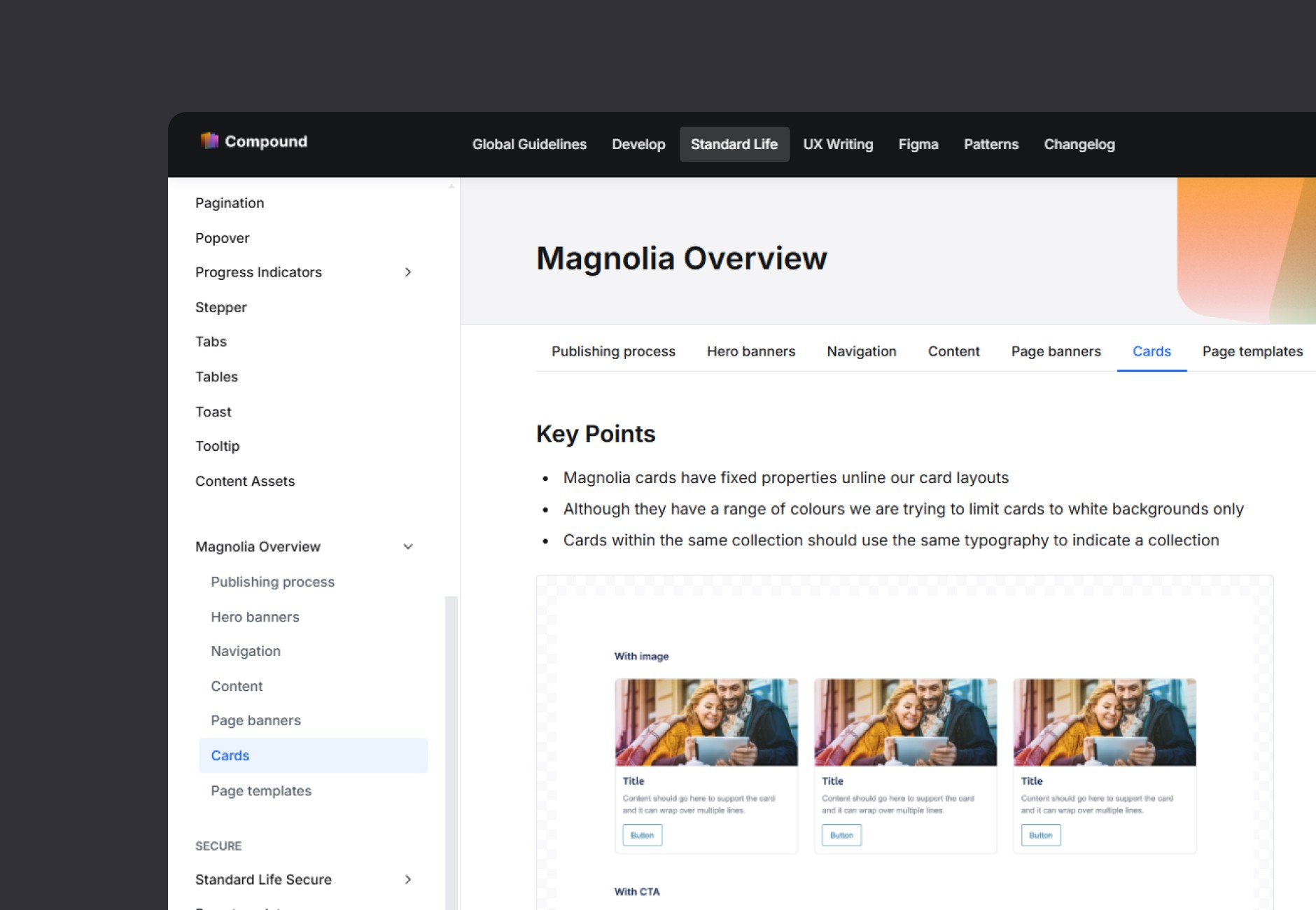
Cards
Cards were a critical component for displaying content summaries, financial information, and CTAs.
Design Goals:
Maintain a clean, professional aesthetic aligned with Standard Life’s brand.
Ensure flexibility for various use cases (e.g., informational, interactive, or navigational).
Create responsive designs for seamless use across devices.
Solution:
Designed modular cards with consistent padding, typography, and actions.
Documented detailed guidelines, which you can view here.
Hero Banners
Hero banners served as prominent headers on landing pages, helping to highlight key messages and direct users to primary actions.
Design Goals:
Deliver impactful visuals that grab user attention while maintaining clarity.
Ensure flexibility to accommodate different types of content (e.g., text-heavy or image-driven).
Solution:
Created variations of hero banners with adaptable layouts for desktop and mobile.
Documented examples and usage guidelines, which you can view here.